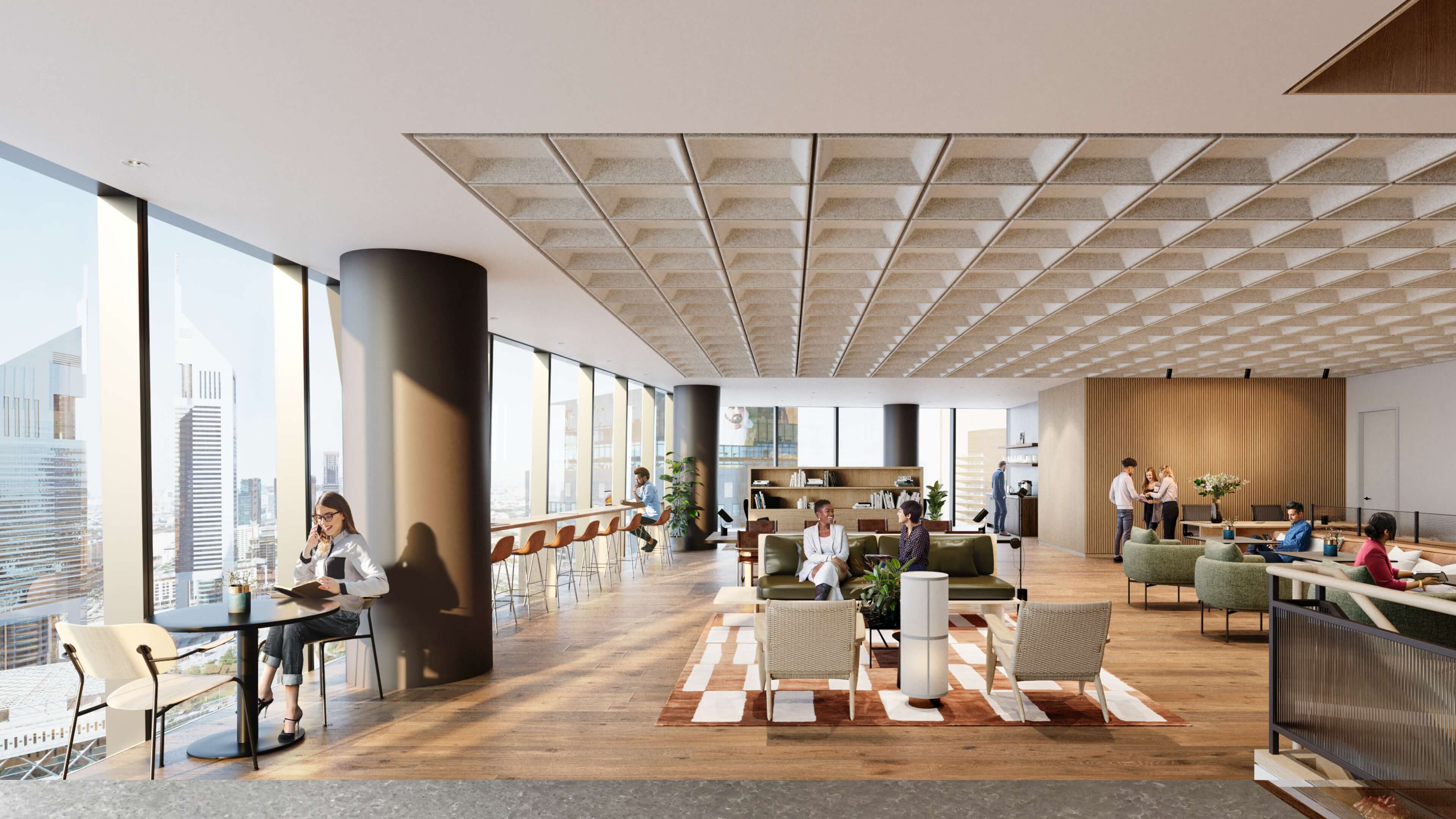
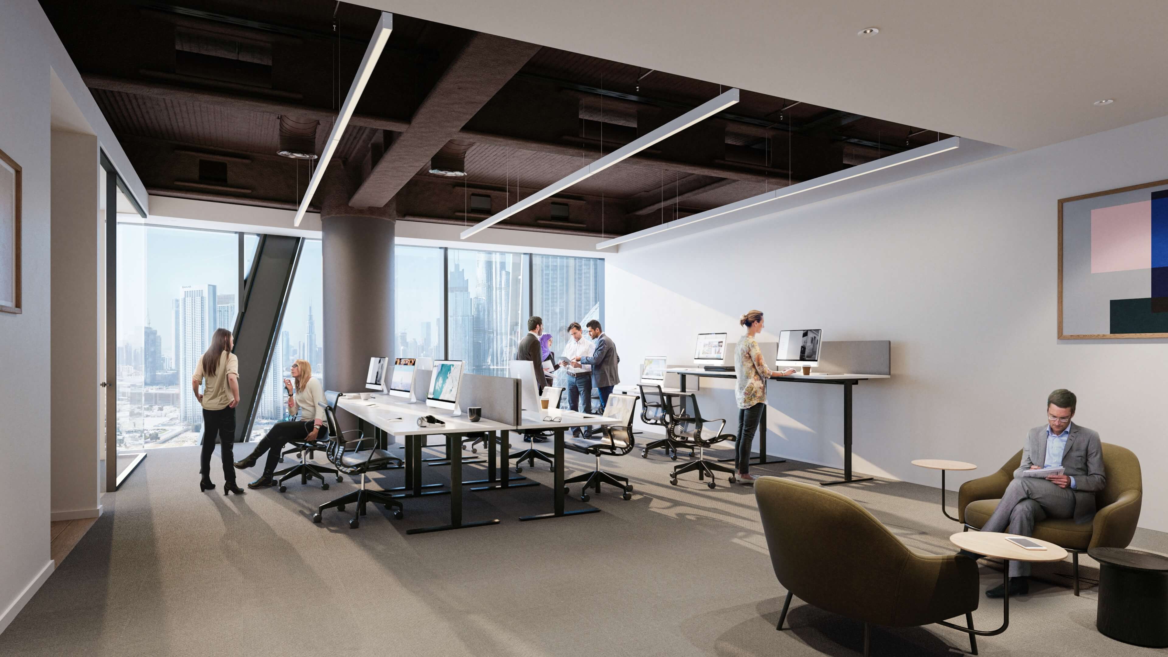
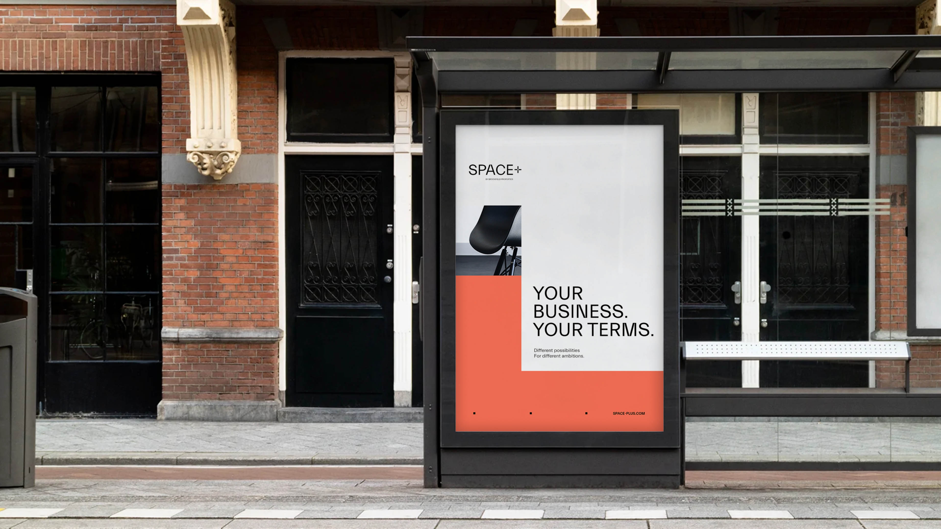
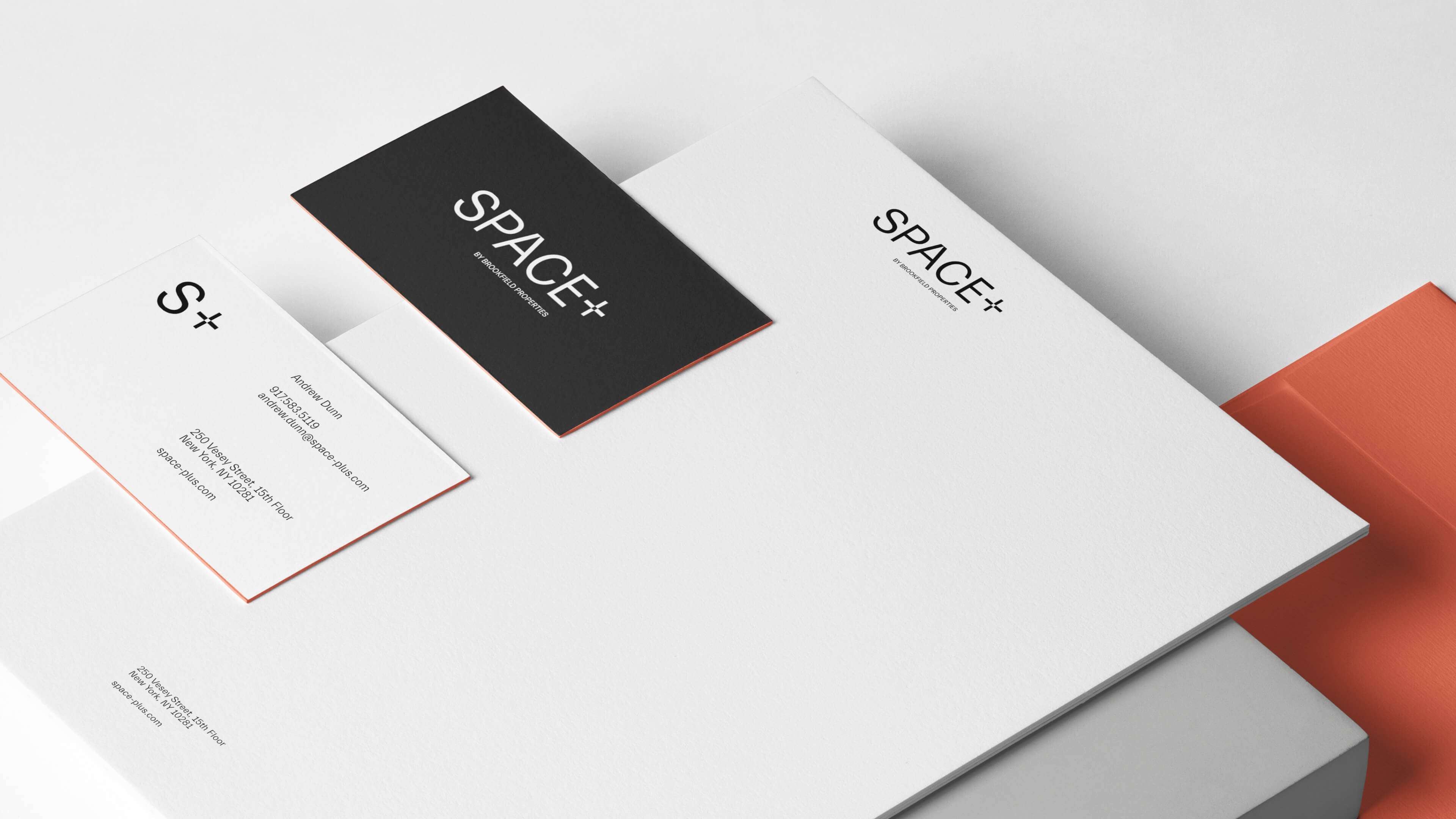
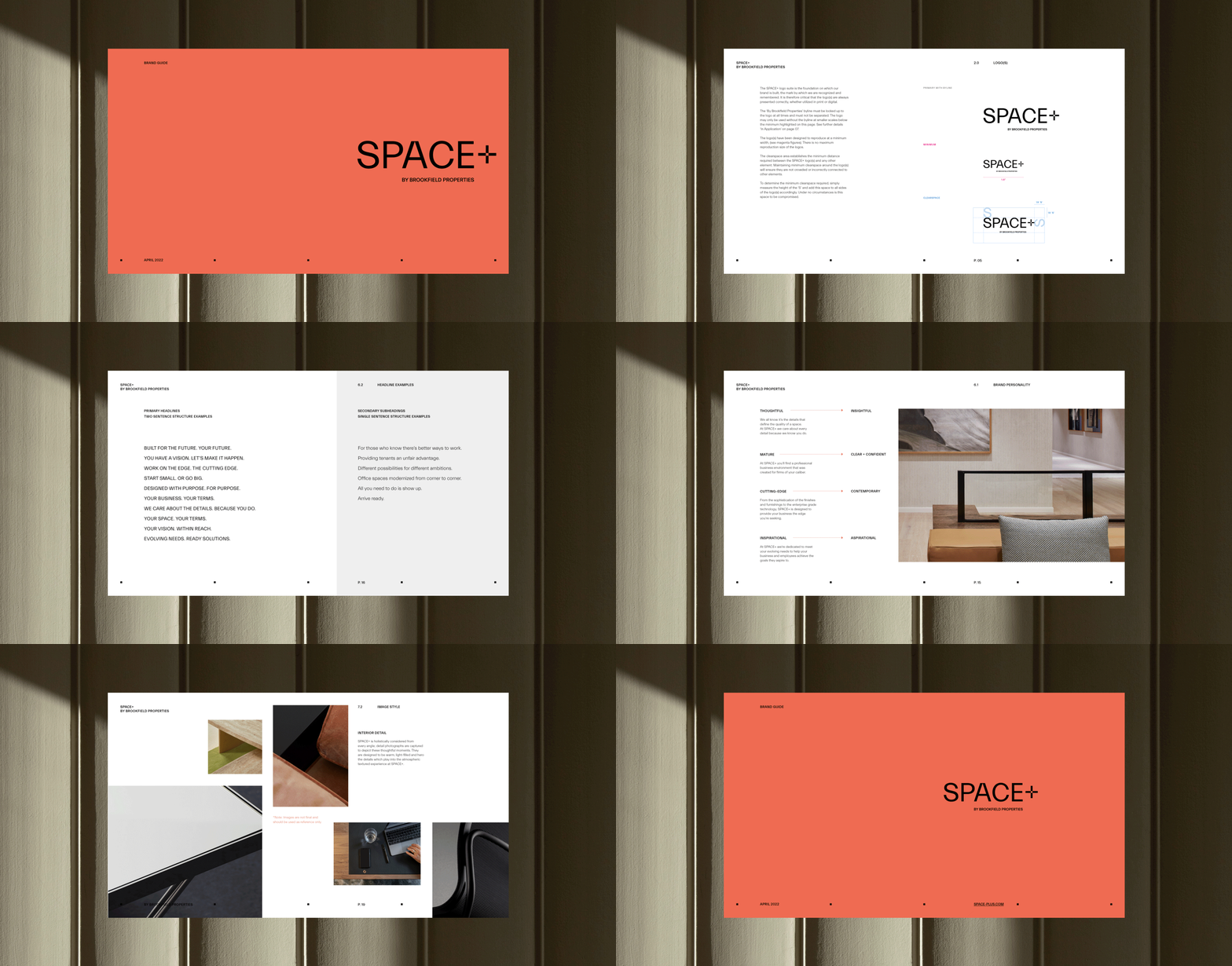
SPACE+ prioritizes the project’s core values of simplicity, clarity, and aesthetics. The logo is strategically grounded with a custom “+” sign, split into four equal parts that represent the cornerstones of the brand: tenant, owner, workspace, and service. The identity is intentionally just as adaptable as the offering, featuring a fluid, yet structured grid system that celebrates the connections between businesses, individuals, and opportunities. A warm color palette reflects the approachable interiors, while a support monogram brings the brand experience full circle.
Messaging is as clever and bold as the space itself, resulting in a smart and selectively witty brand voice. Punchy pieces of copy showcase an urban attitude that sharpens the narrative. This thought-provoking strategy builds on polished, refined visuals to solidify SPACE+ as a place ready-made for realizing visions.
