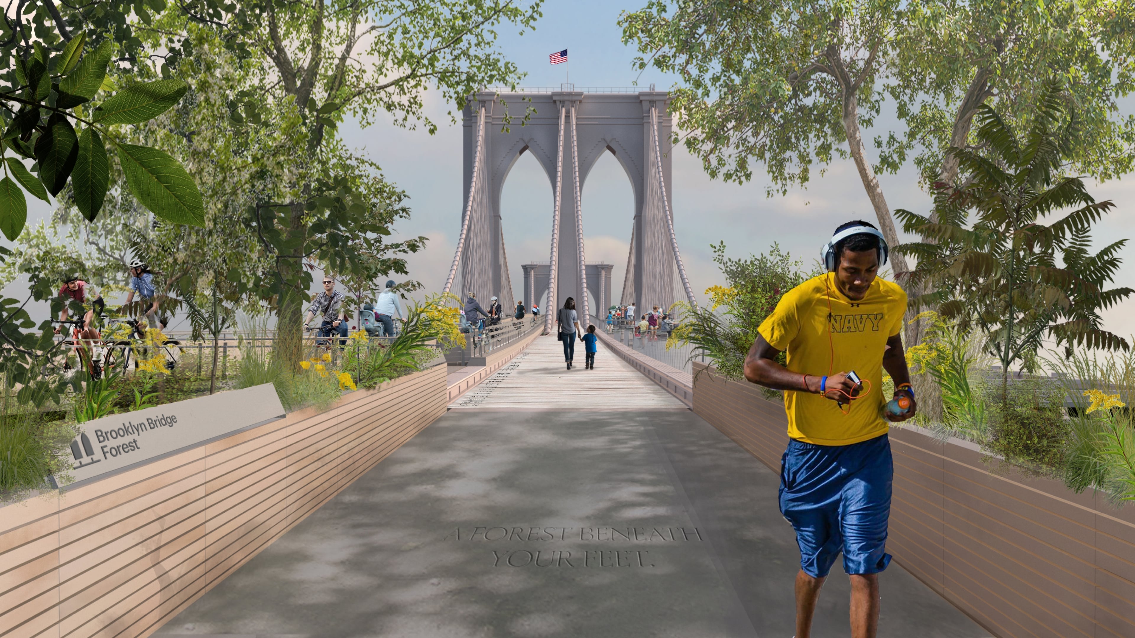
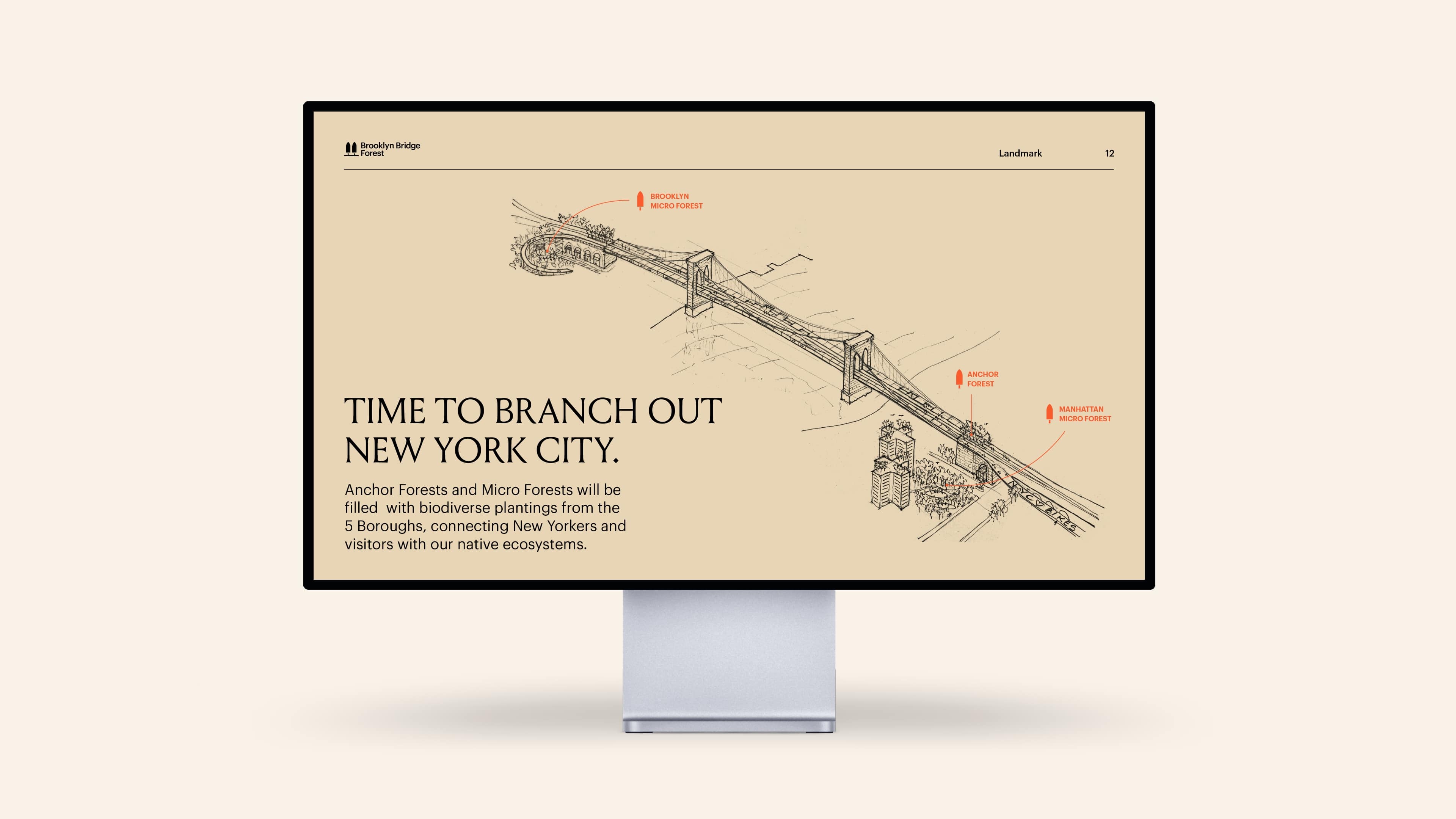
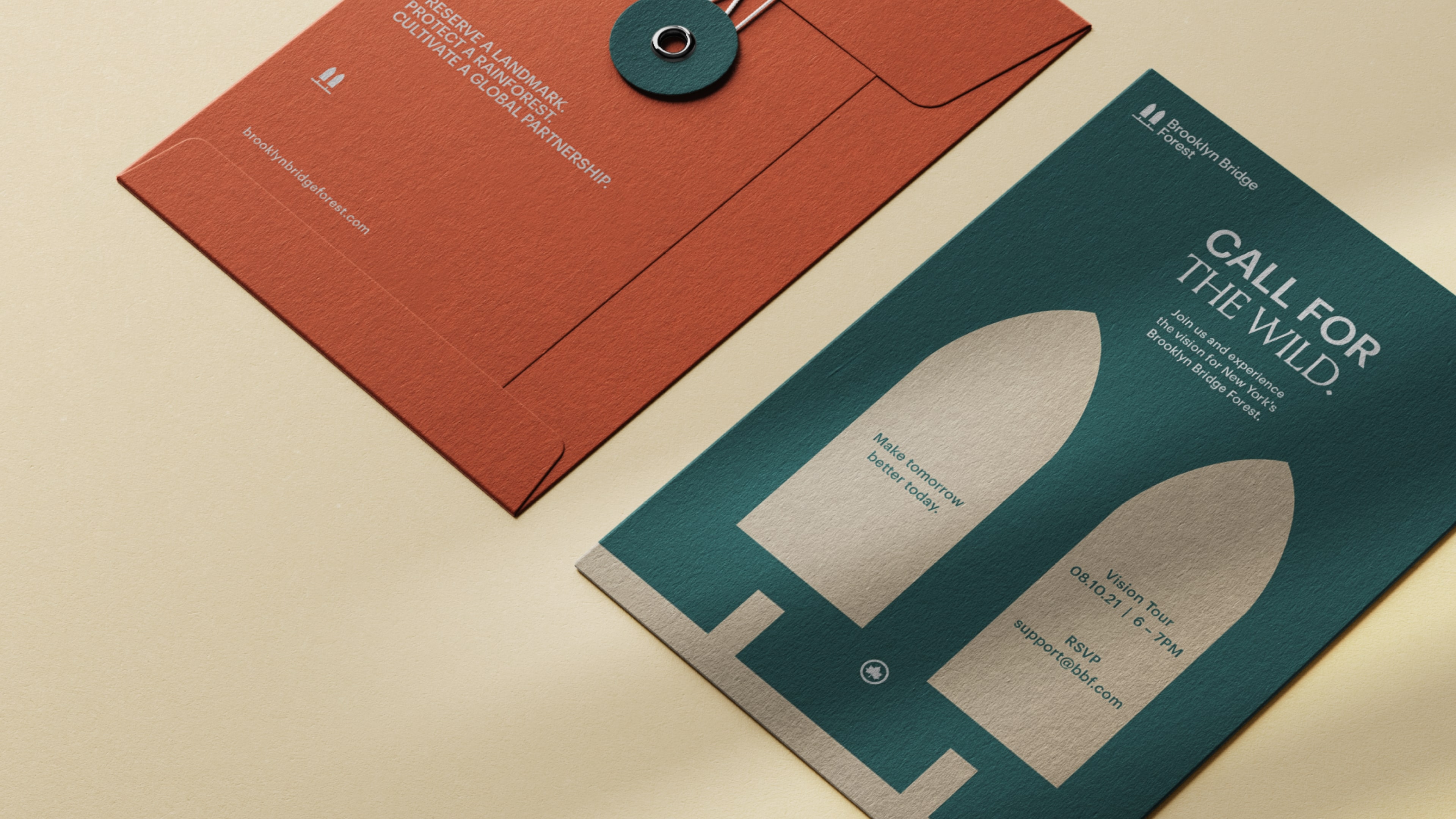
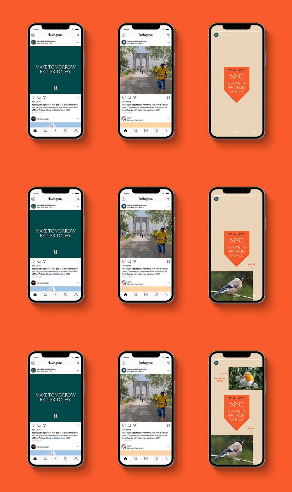
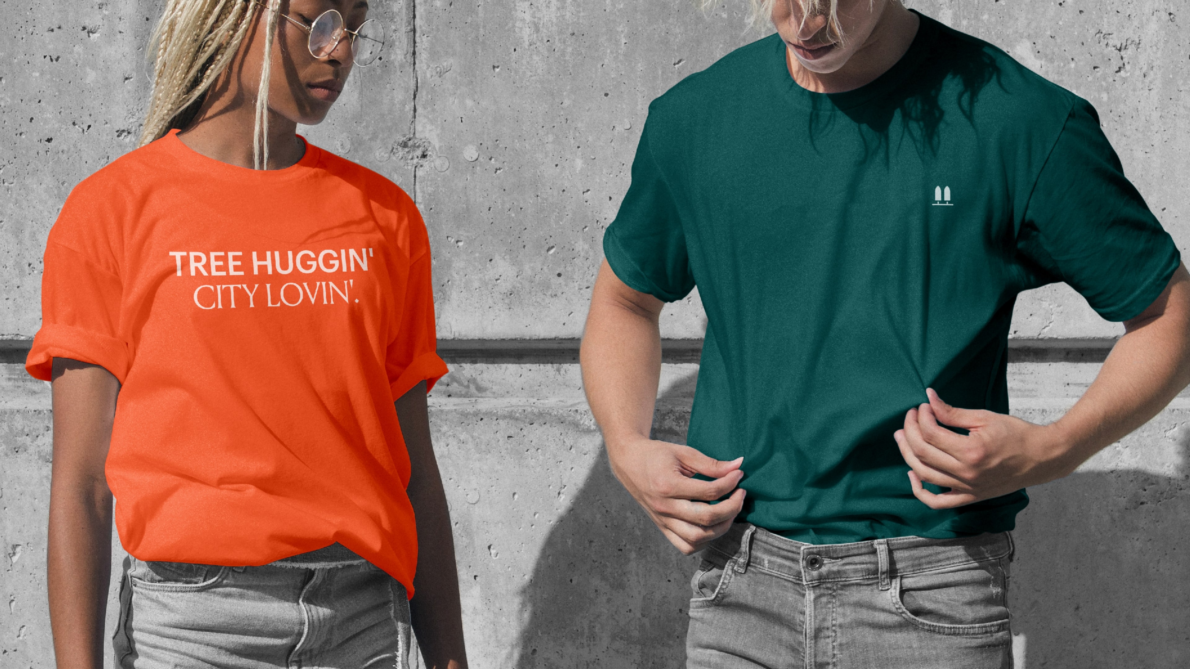
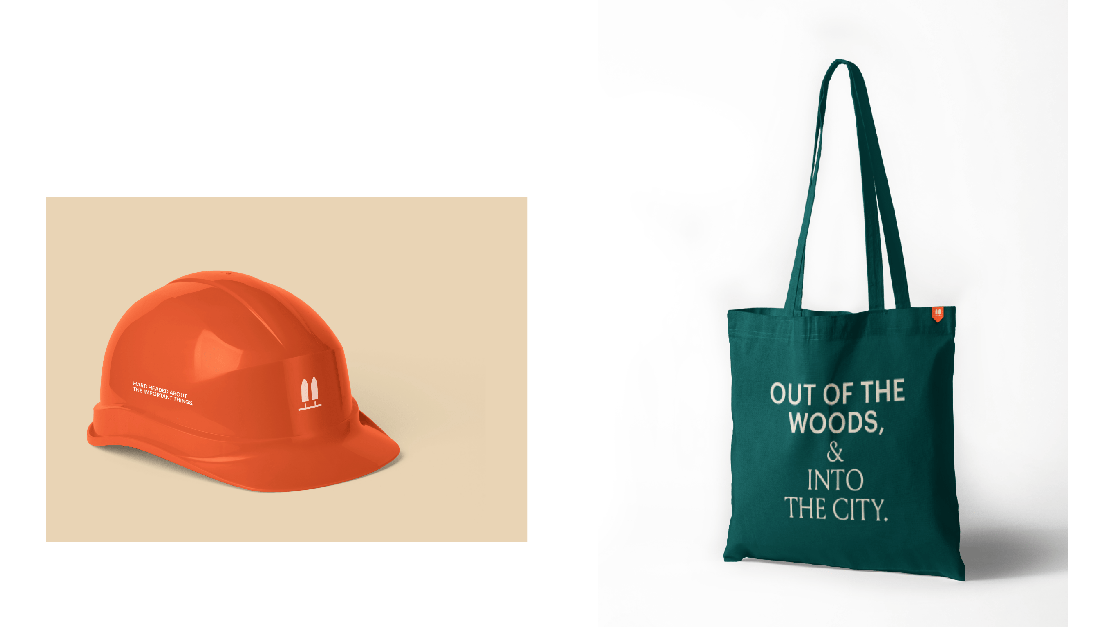
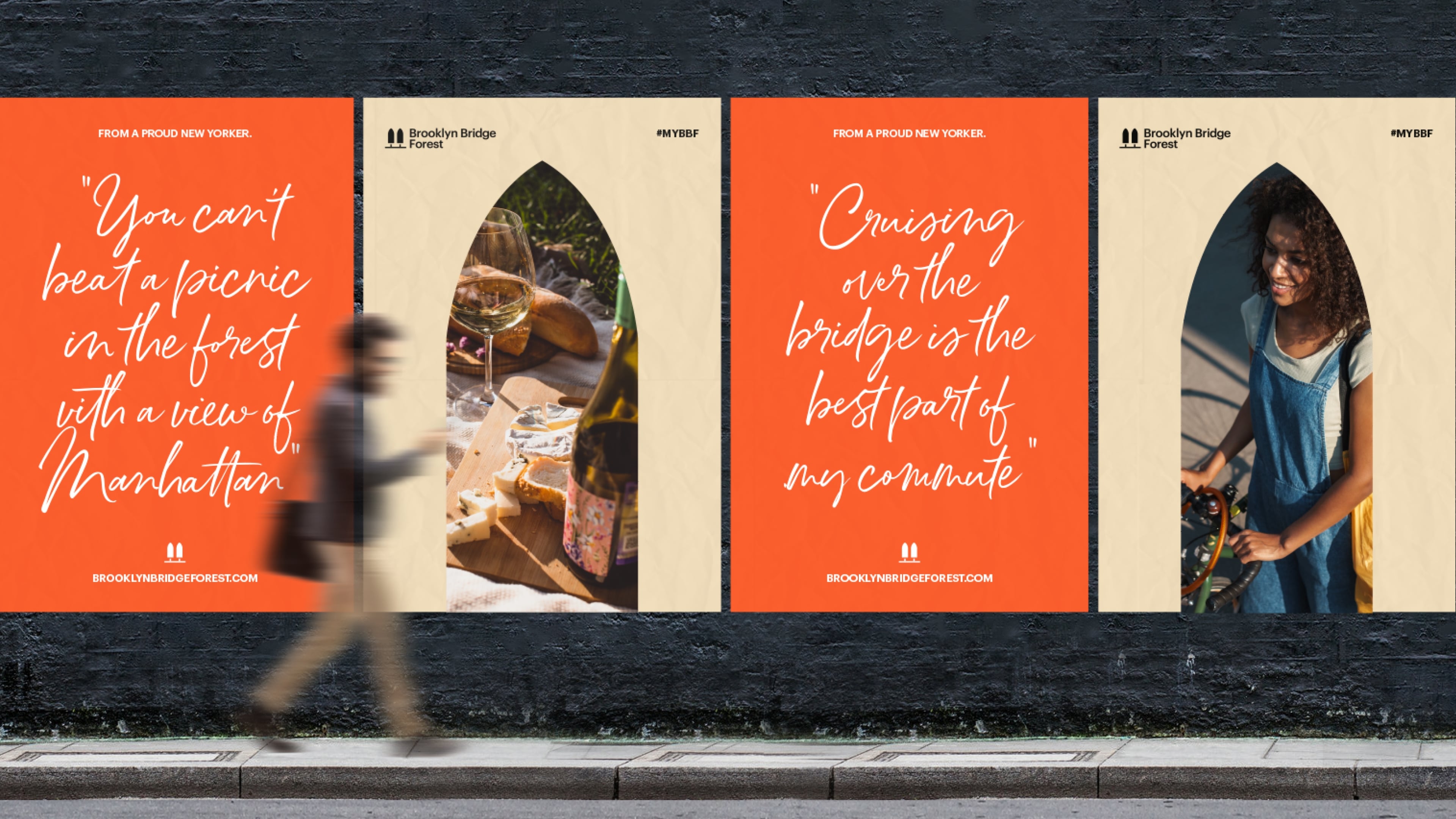
Our approach was centered around the concept of bridging relationships: between people and place; city and nature; Guatemala and New York City; and New York City and the world. Key color choices reflect unique elements and energies that come together through the Brooklyn Bridge Forest experience. A duality of typefaces represent both the stone-chiseled character of old and the contemporary nature of progress. The simple, but striking logo serves as a timeless nod to the bridge, the forests, and the overarching vision. Whimsical, yet meaningful, messaging strategically alludes to nature while also speaking passionately about the project’s impact, the landmark’s evolution, and the future’s promise.
With every creative decision, we were careful to respect Brooklyn Bridge’s history while celebrating Brooklyn Bridge Forest’s fresh perspective. More than a brand, the result is a beacon of innovation and ingenuity and a new symbol of hope, community, climate action, and positive change that New York will proudly share with the world.
