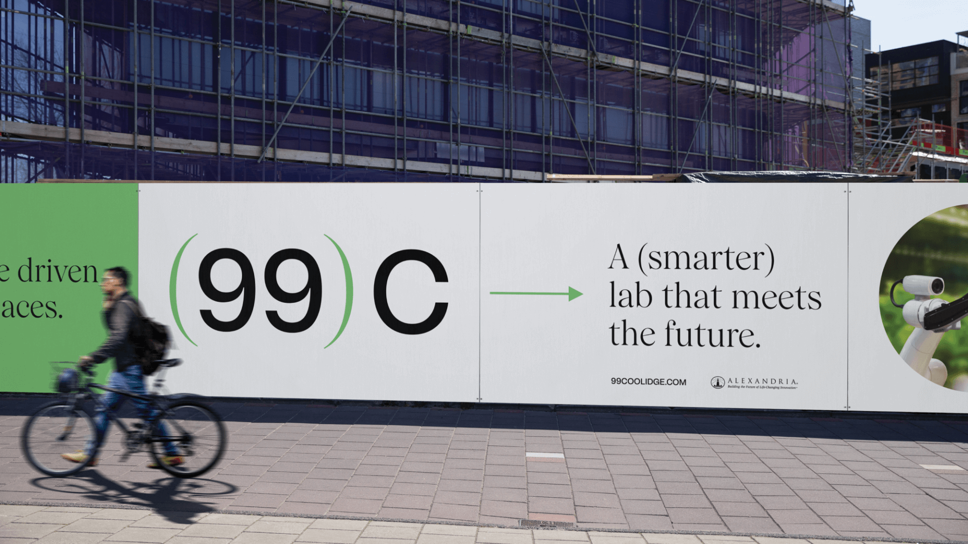
99 Coolidge is brought to life with a thoughtful brand narrative that connects ARE to tenants with a simple, yet engaging communication style. Graphically and verbally, the distinct use of parentheses nods to scientific formulas, while subtly calling out key company values. The duality continues with the juxtaposition of two typefaces, a san serif which represents the more rational, factual aspects of the community and a serif, which adds moments of warmth and humanity.
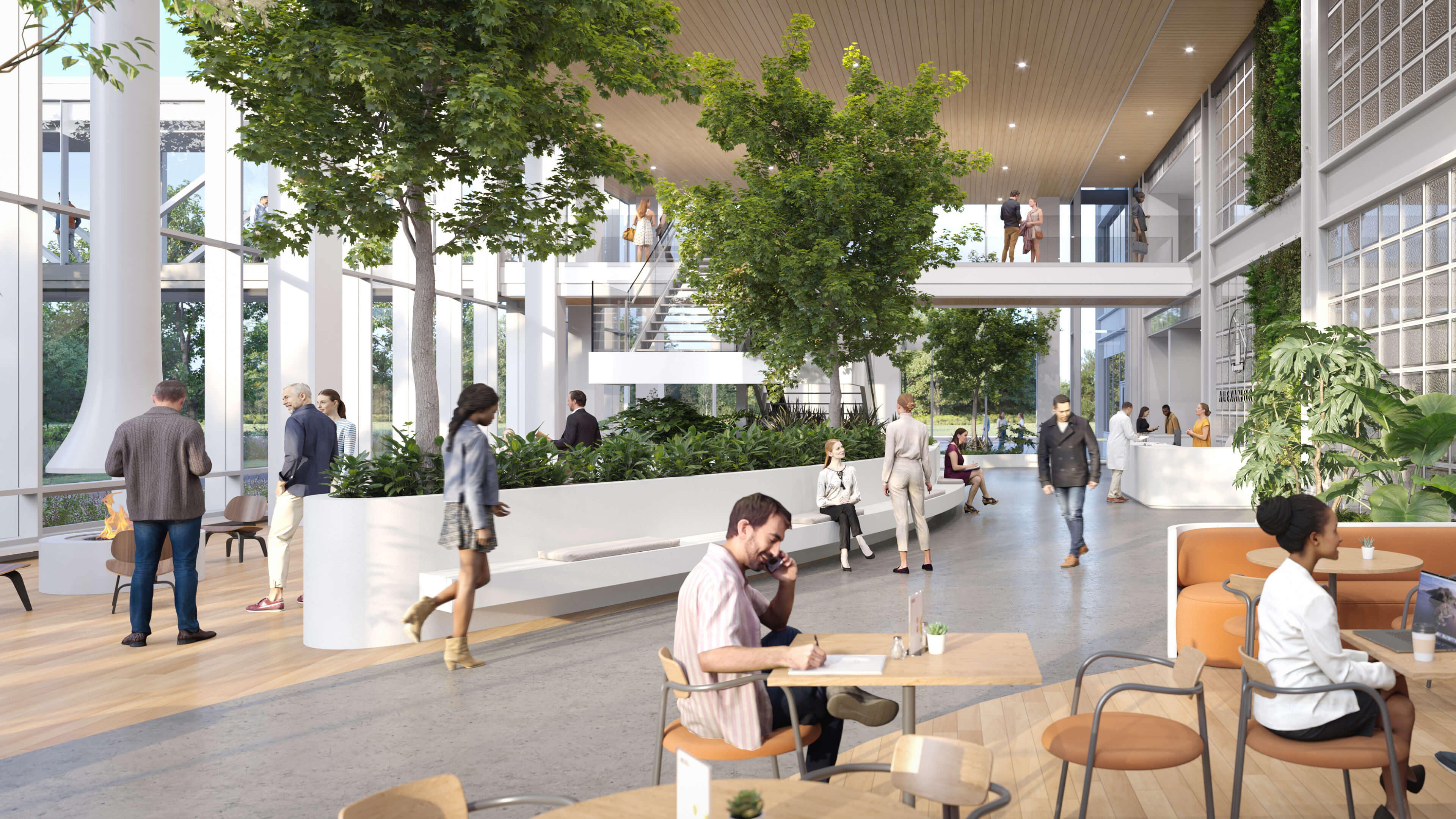
The brand scales seamlessly as a thoughtful kit of parts, all of which complement each other with practicality and purpose. Circular graphic elements carry the essence of the parenthesis further, subtly representing moments of scientific discovery, such as peering through a microscope or observing a petri dish. The dominant green color reflects surrounding nature, biophilic design, and the ongoing growth that will propel 99 Coolidge — and Watertown — into the future.
The dynamic elements of this brand expression come together to provide a fresh perspective on life science that evokes curiosity and establishes respect, solidifying 99 Coolidge as an impactful leader of life science in Watertown and beyond.


