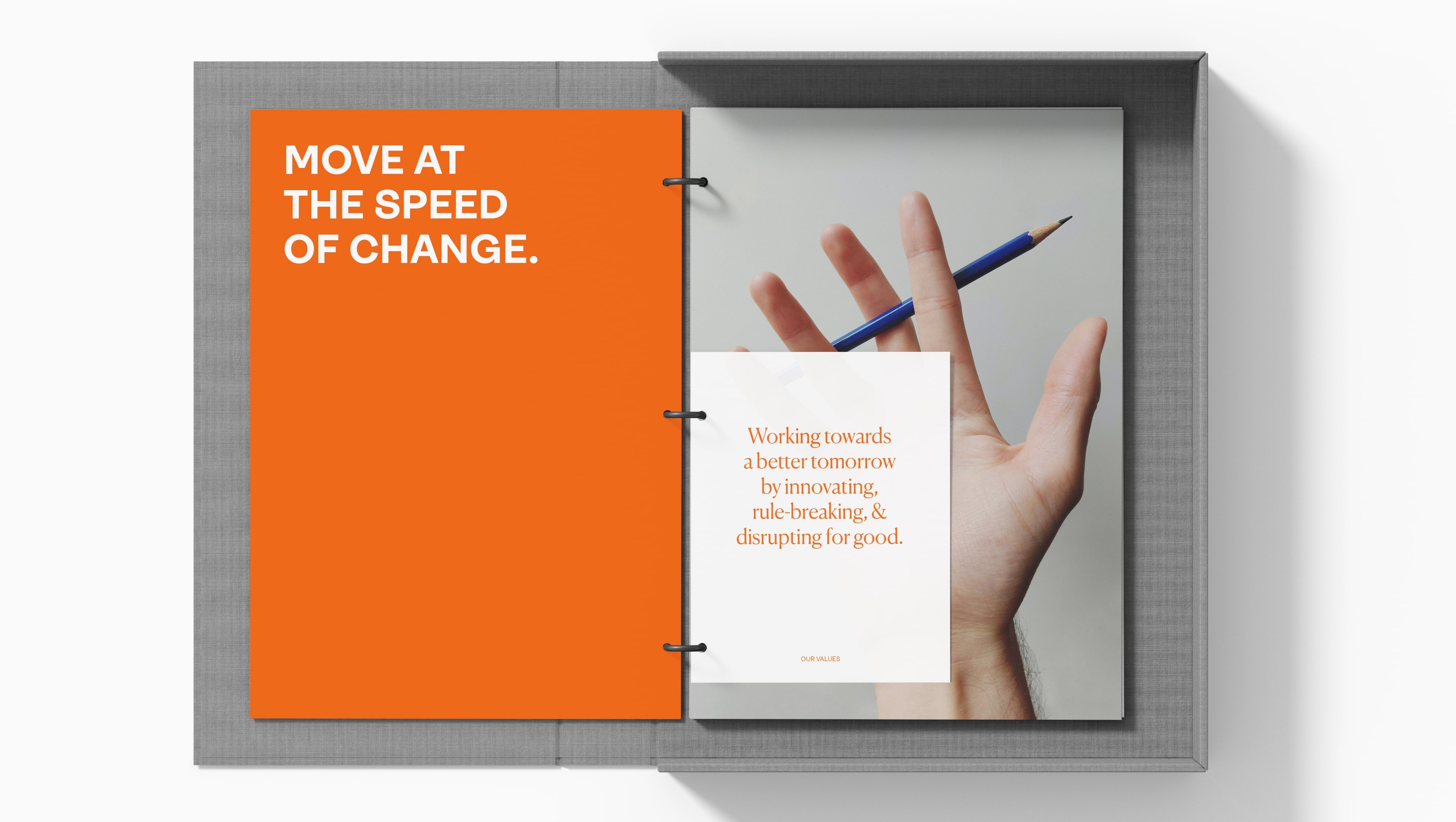
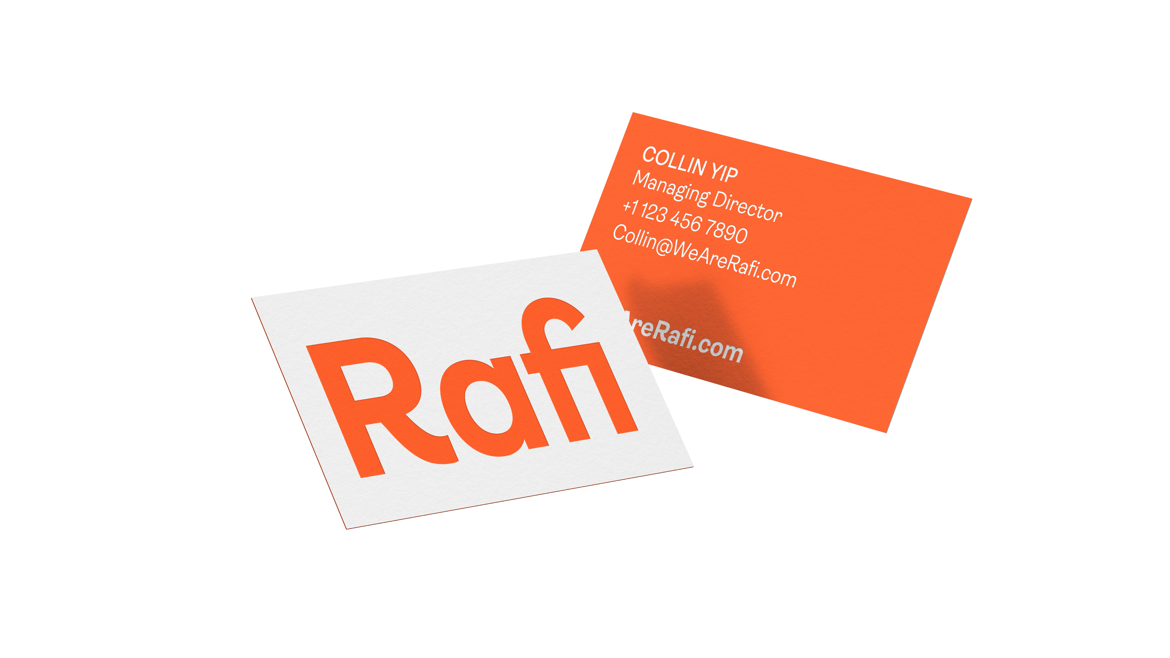
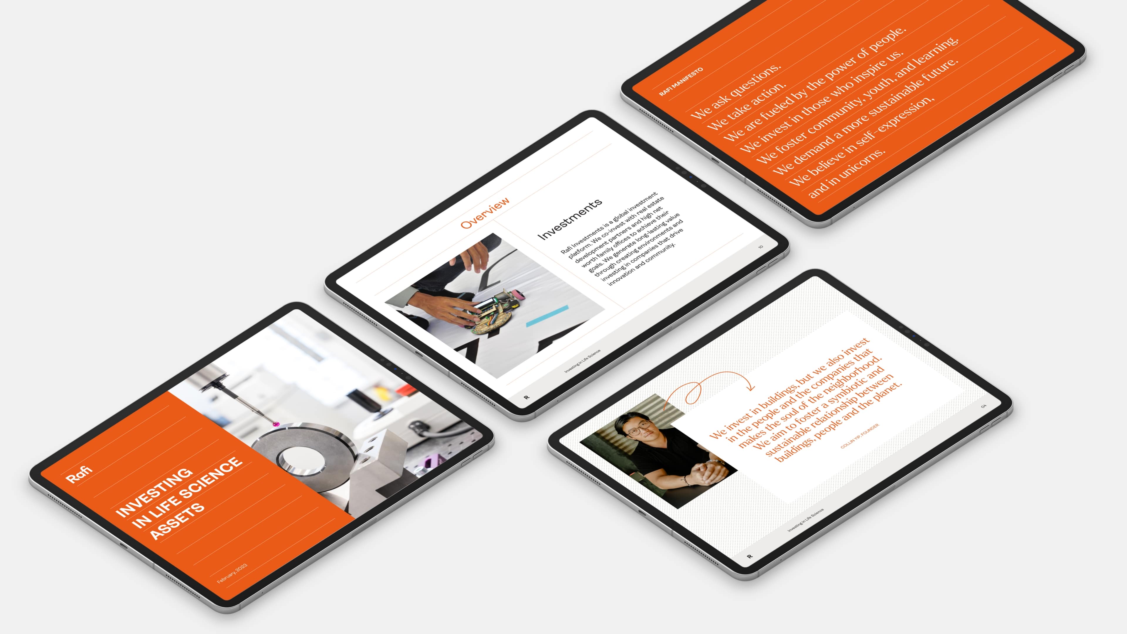
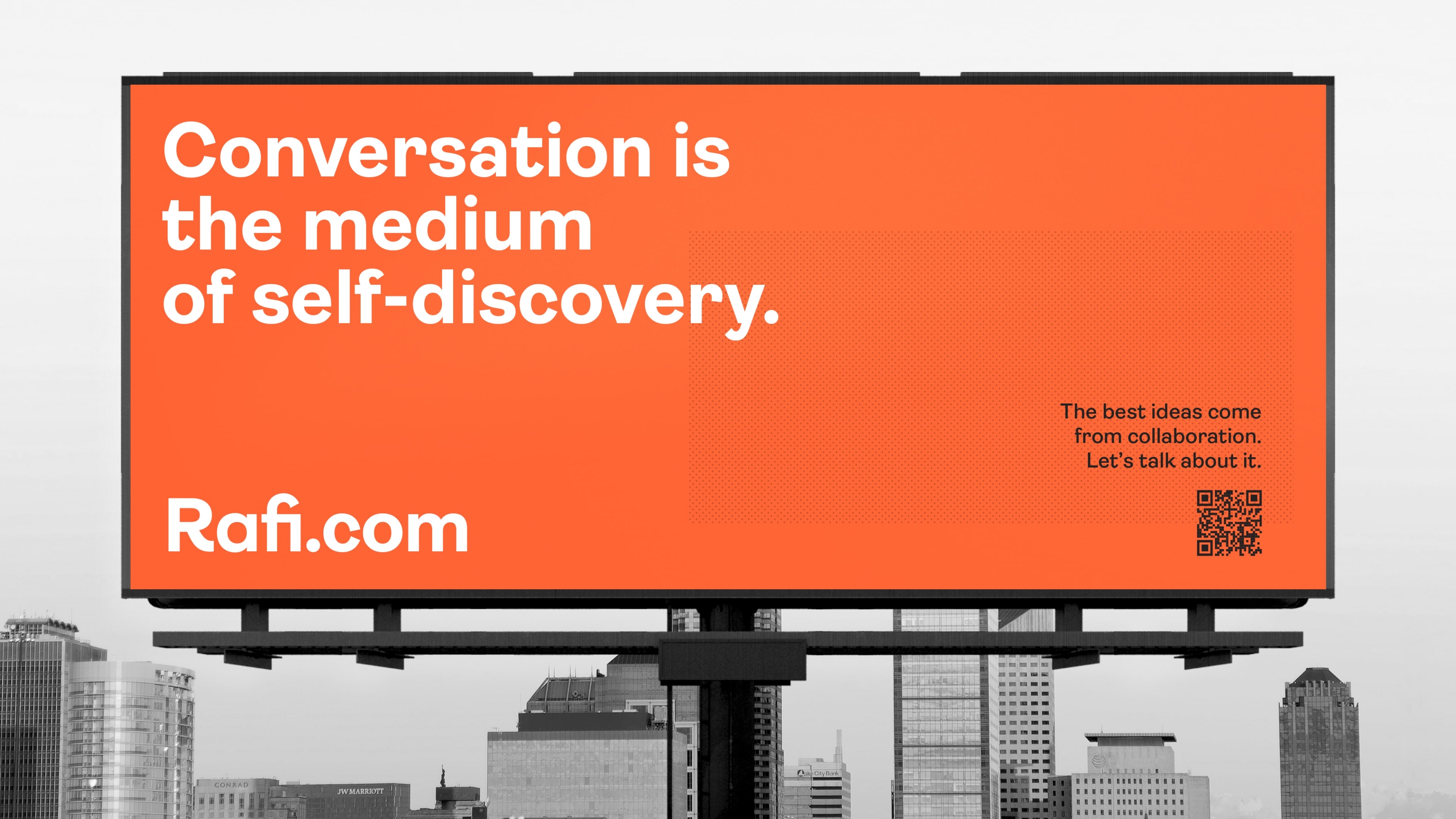
From the beginning, we set out to create a brand that wasn’t beholden to real estate’s norms. An energizing orange stands apart as their primary color, a striking representation of what makes them different: their warm collaborative spirit. That dynamic spirit continues throughout via a notebook-inspired design system that features animated content layouts, hand-drawn graphic elements, and varied entry points that invite users to discover more about Rafi through uniquely compelling interactions.
Two contrasting typefaces play off each other, creating a strong sense of approachability and setting the stage for bold, yet engaging language choices that emphasize Rafi’s purpose-driven perspective of real estate. From leading headlines to supporting verbiage, every piece of copy reinforces the brand’s welcoming confidence, while addressing their grander vision of innovating for good. Ultimately, this ambitious voice builds on our inventive design system and forward-thinking strategy, sparking a legacy brand that challenges assumptions, pushes boundaries, and welcomes everyone to join in building a better tomorrow.
