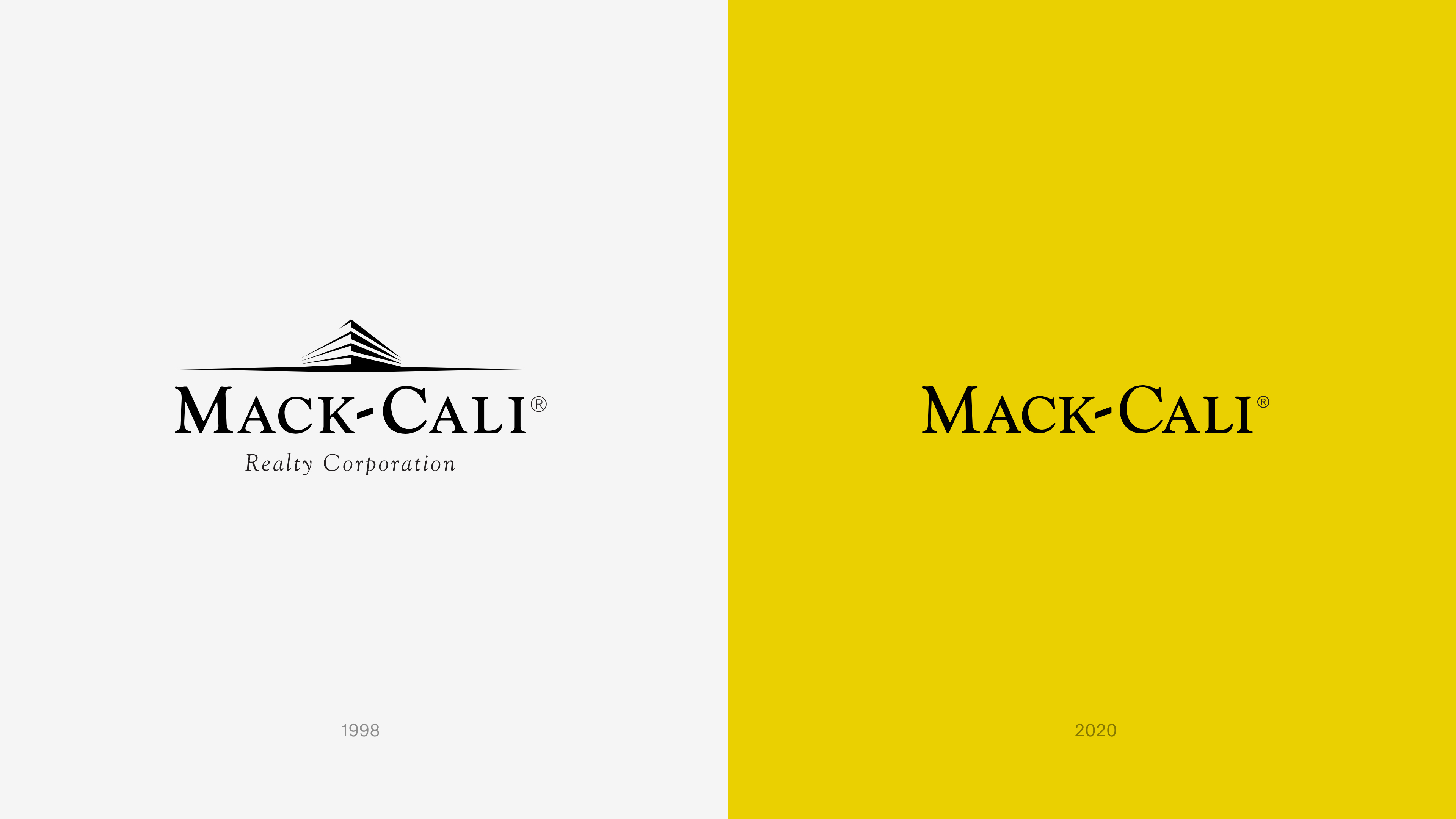
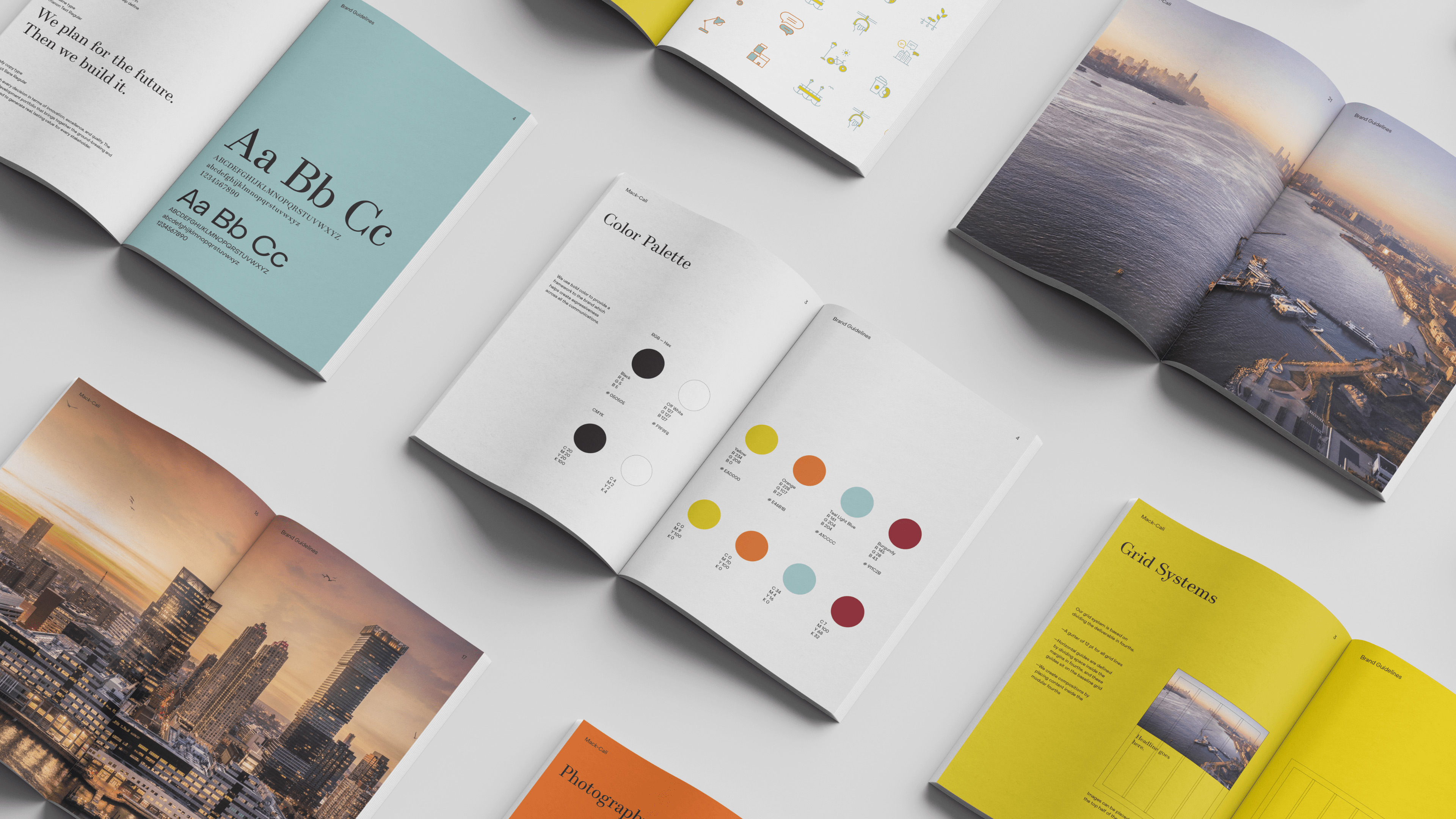
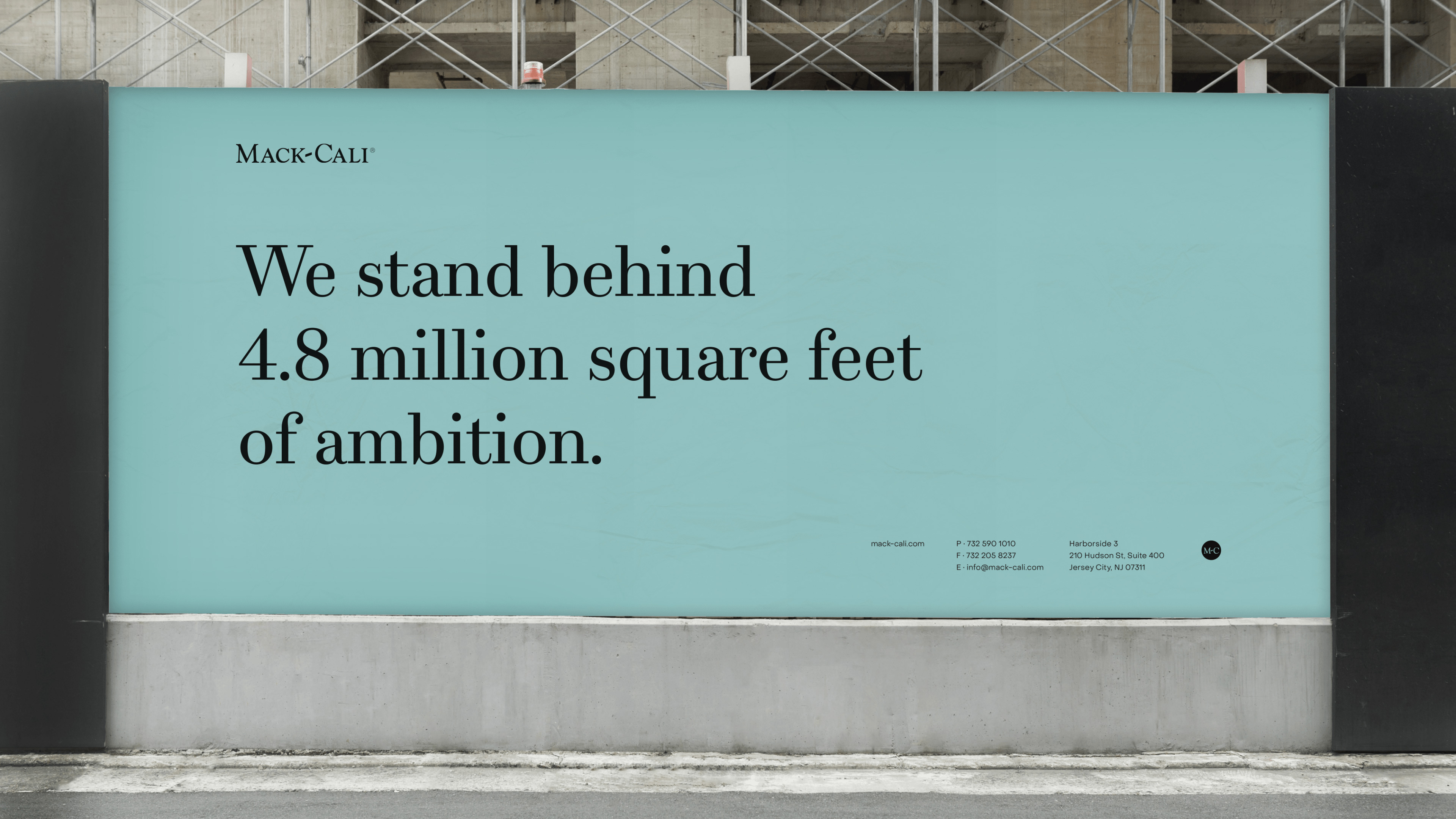
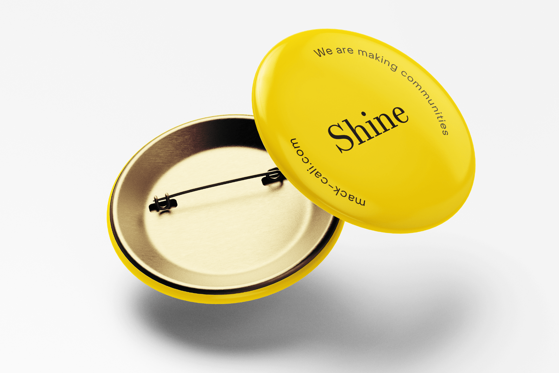
Pivoting around the notion of “going for gold”, the new identity is vibrant and enthusiastic. Alluding both to the Gold Coast and exceptional achievement, a warm, rich palette pops with gold, while upbeat copy employs a can-do language. The brand logo, though retaining its historical wordmark, has been simplified and refined to feel clean and contemporary.
A central element of the rebrand is a responsive website that serves as Mack-Cali’s calling card. Light, open and user-friendly, the site combines both lifestyle and aspirational moments with a clean, rational design for easy browsing of the firm’s extensive portfolio and new strategic plan.
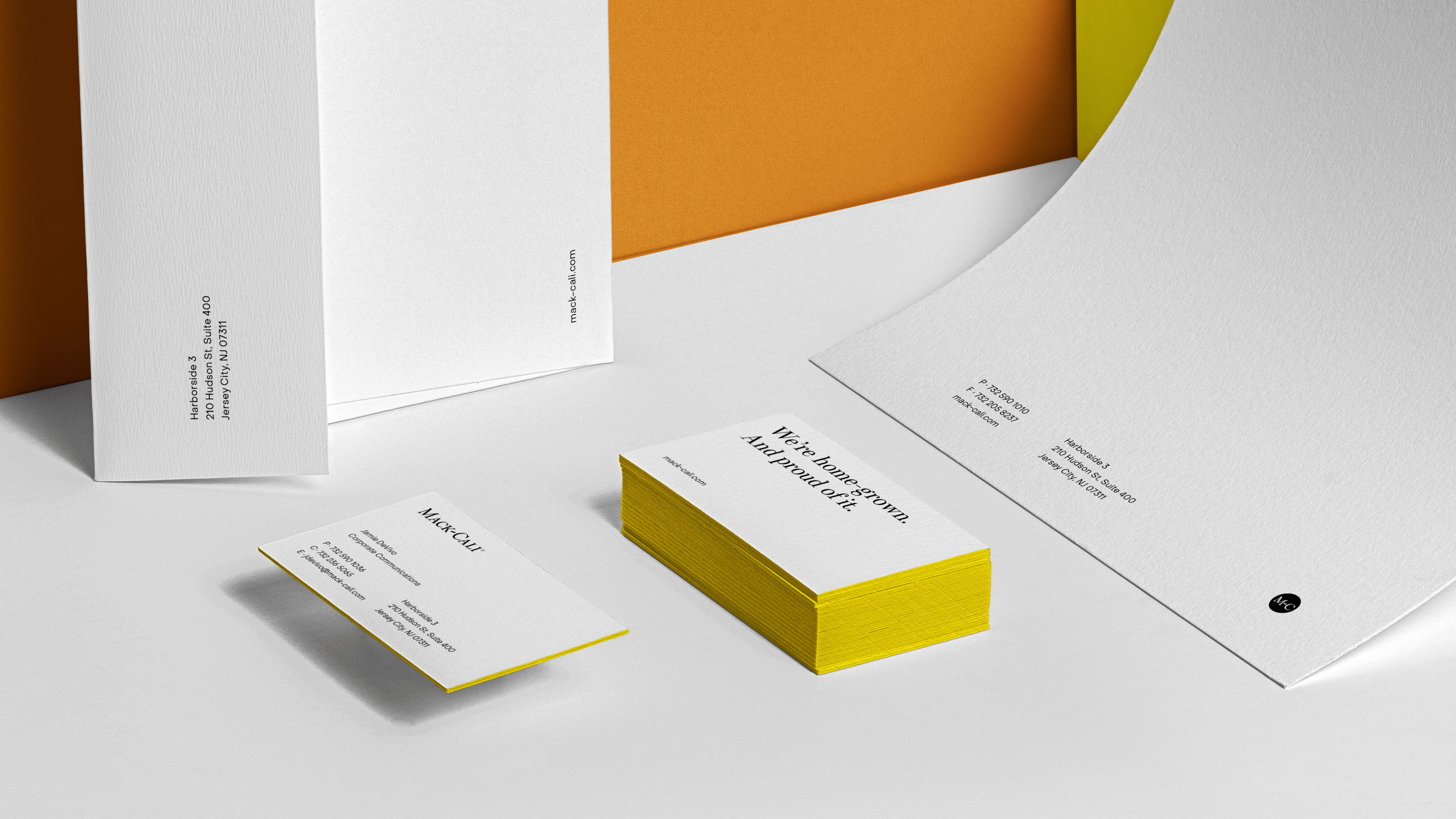
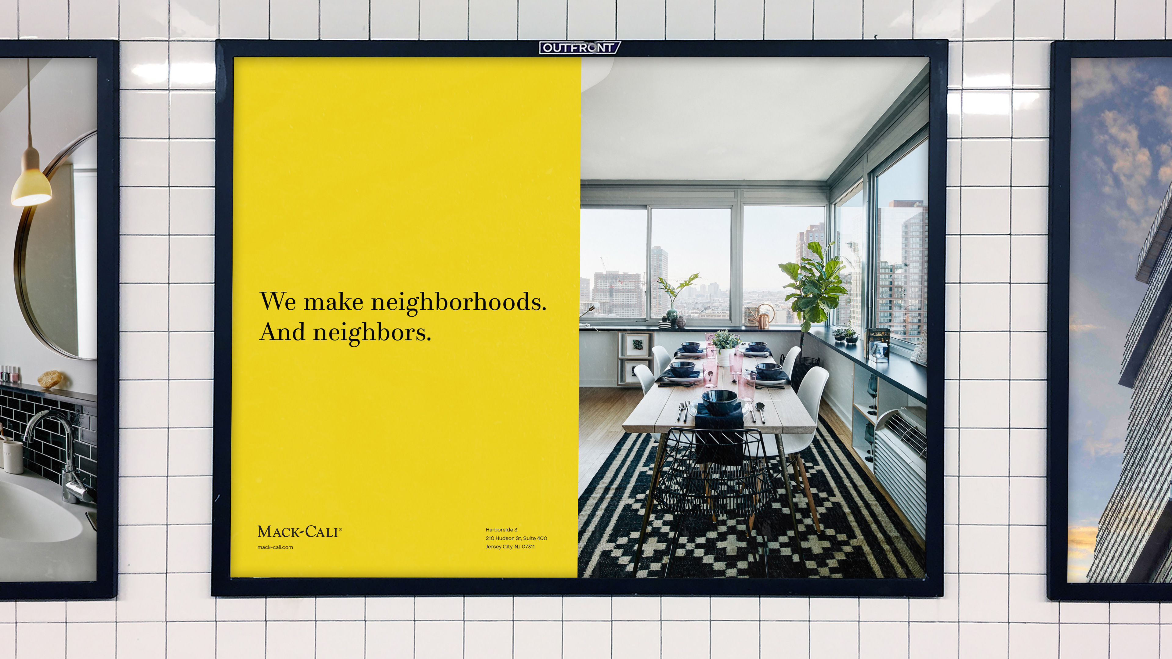
Subversively bold and impactful, a print outreach campaign across key trade magazines and newspapers drew attention to the new positioning, while also supporting and enhancing it. A suite of additional internal and external materials, from video presentations to market brochures to sell sheets, extends and reinforces the new identity, ensuring that when it comes to asserting its influence in the market, Mack-Cali is golden.
