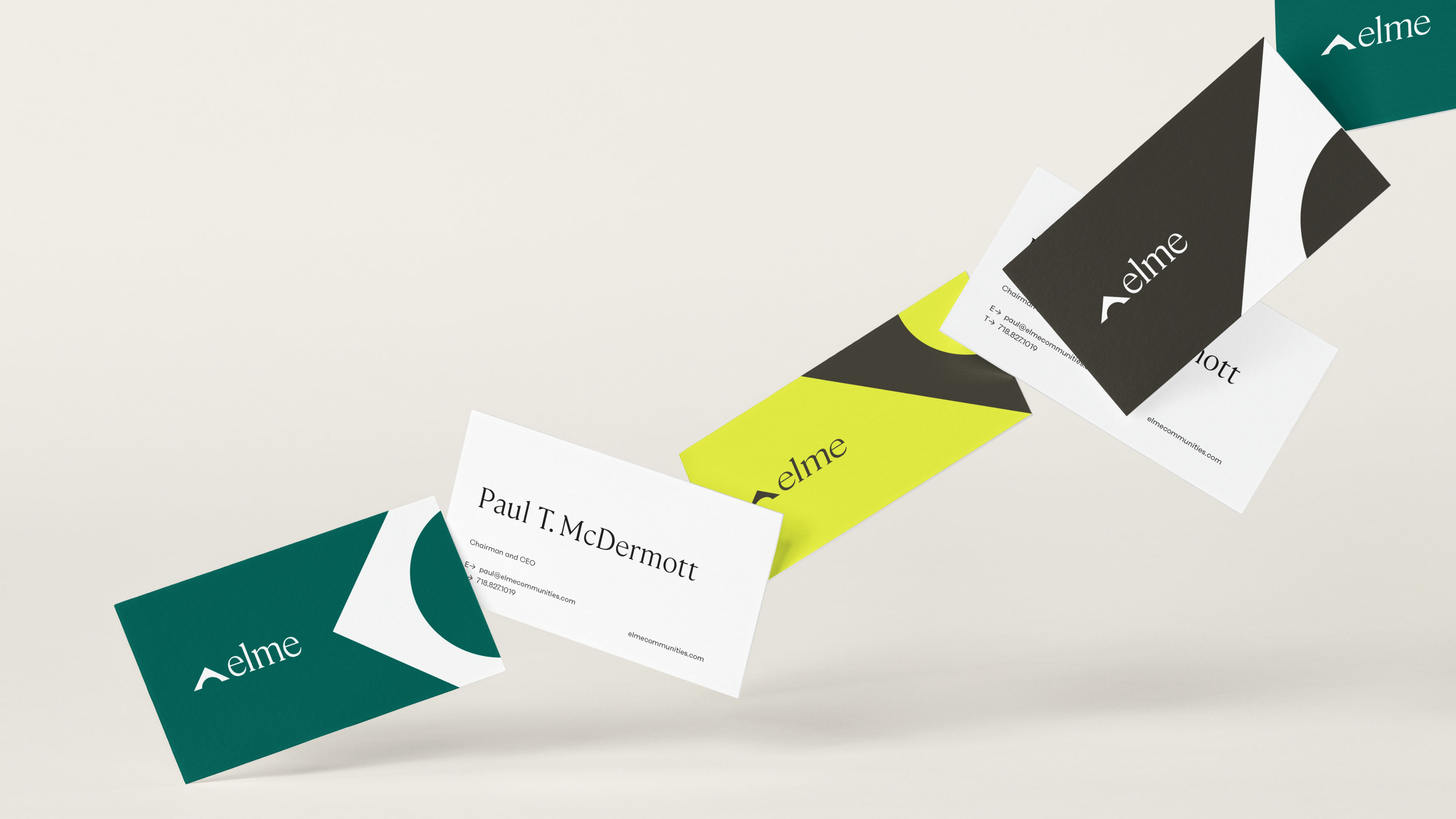
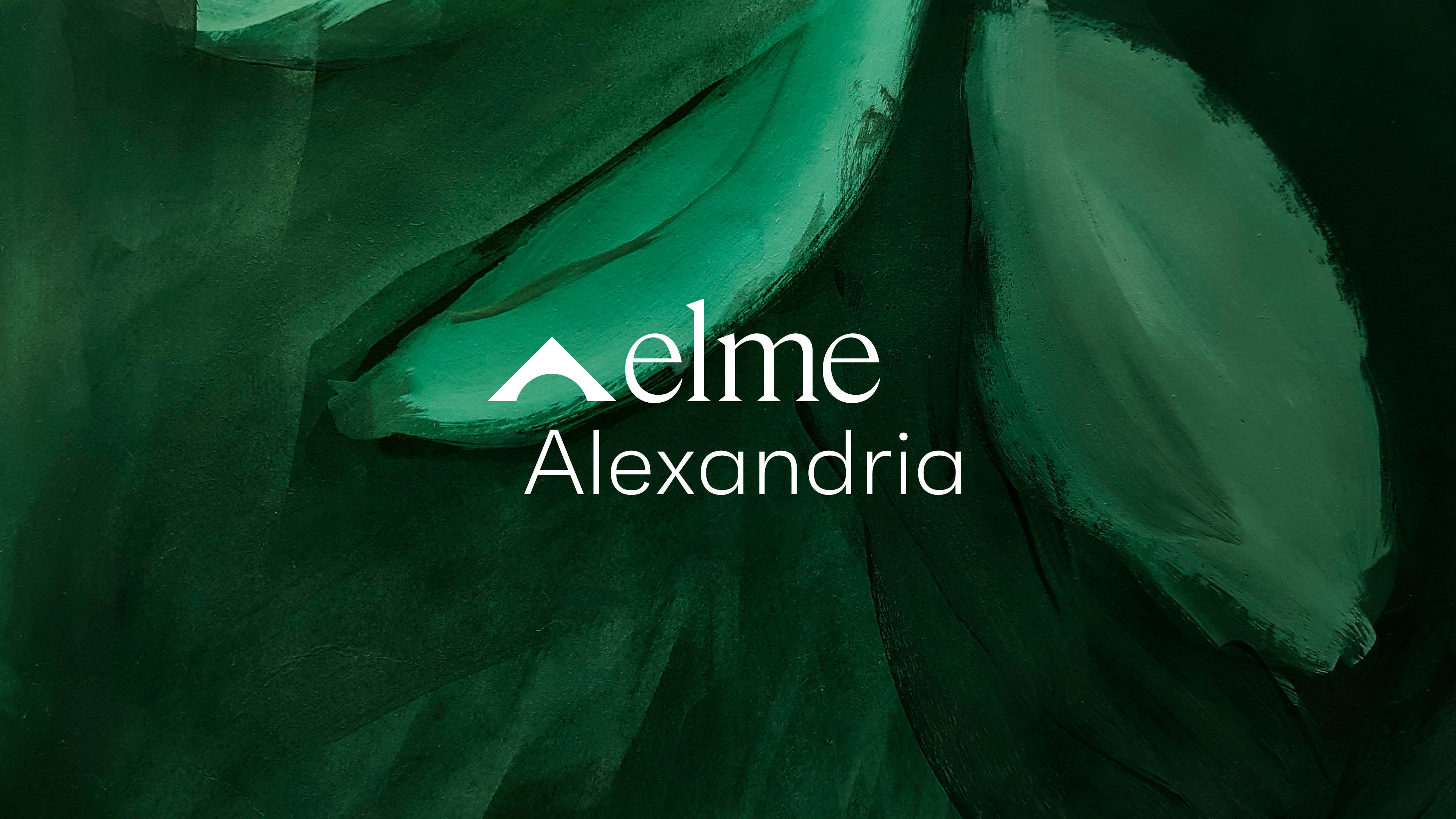
The new identity began by re-naming WashREIT to Elme Communities. Elme conjures up images of an established tree, evoking feelings of strength, dependability, and steadfastness. Deeply-rooted in meaning, it alludes to the idea of “Welcome Home” an invitation for residents to find a safe and comfortable home, as well as “Elevate Home,” a sentiment that ties to the overall mission of the brand.
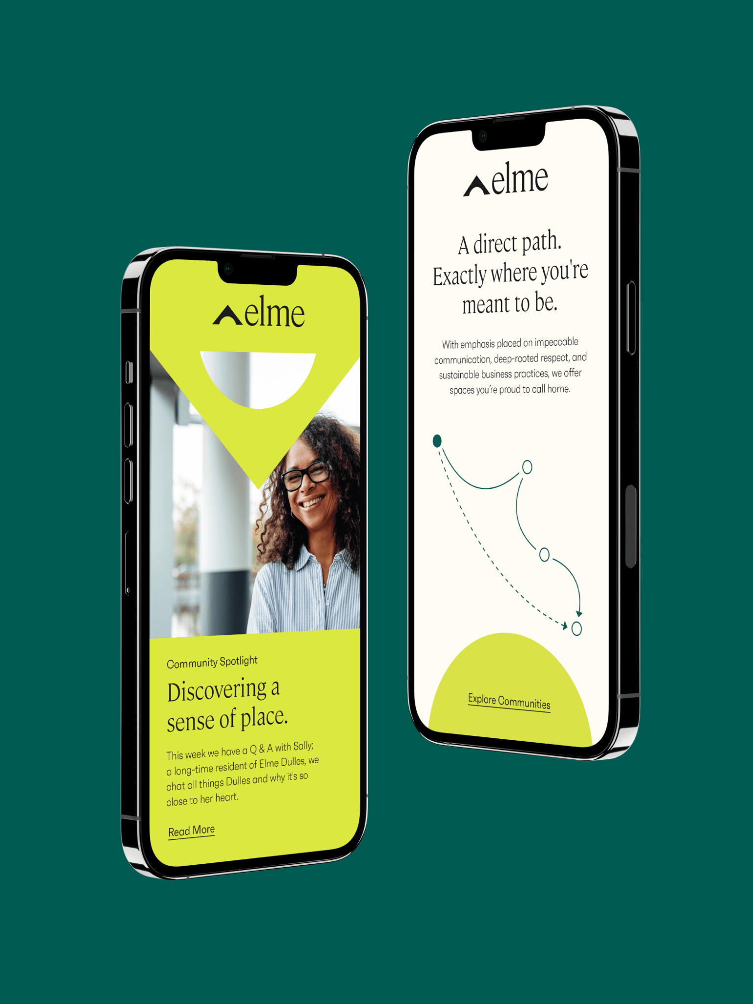
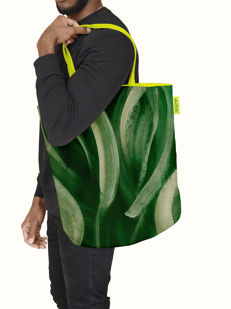
Our design approach uses directional motifs and simple, human language to signal new direction, while also hinting at Elme’s ability to guide with experience. An earthy color palette of greens and neutrals mixes with an unexpected pop of chartreuse, creating a warm, friendly, and uniquely engaging brand feel that’s present at every turn. Each piece of creative stems from the seed of a logo that represents shelter, value, direction, and progress–ultimately growing WashREIT into the more directional Elme brand, primed to lead the way for both residents and investors alike.


