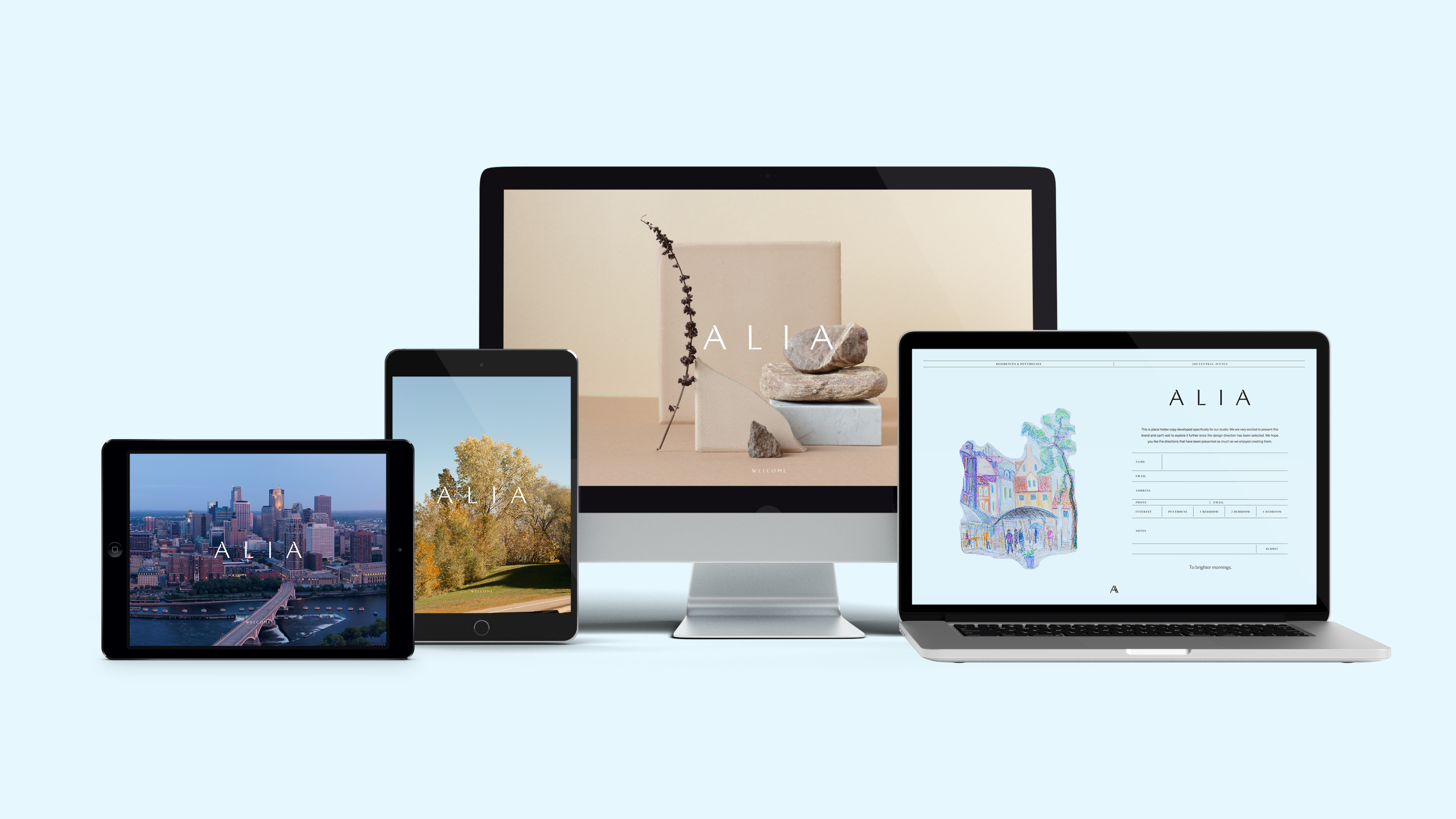
An earthy, welcoming color palette sets the stage for the brand, with the addition of an airy blue that gently nods to the tower’s height. Two carefully chosen typefaces capture the essence of the neighborhood and property: one that creates a sense of conversational warmth, and another that elegantly pays homage to the surrounding history. A combination of images and illustrations ensure the brand mirrors the best of Minneapolis, highlighting ALIA’s finest moments with elevated approachability.
The purposefully simple visual identity serves as a clean canvas for poetic and narrative-driven language. Refined word choices make the voice feel luxurious, while hints of “Minnesota nice” and nods to local culture ground every aspect of communication. Layered together, the striking visuals and refreshing voice bring ALIA to life through an all-encompassing brand identity that eloquently represents this property’s potential to add to the richness and community of Minneapolis.
