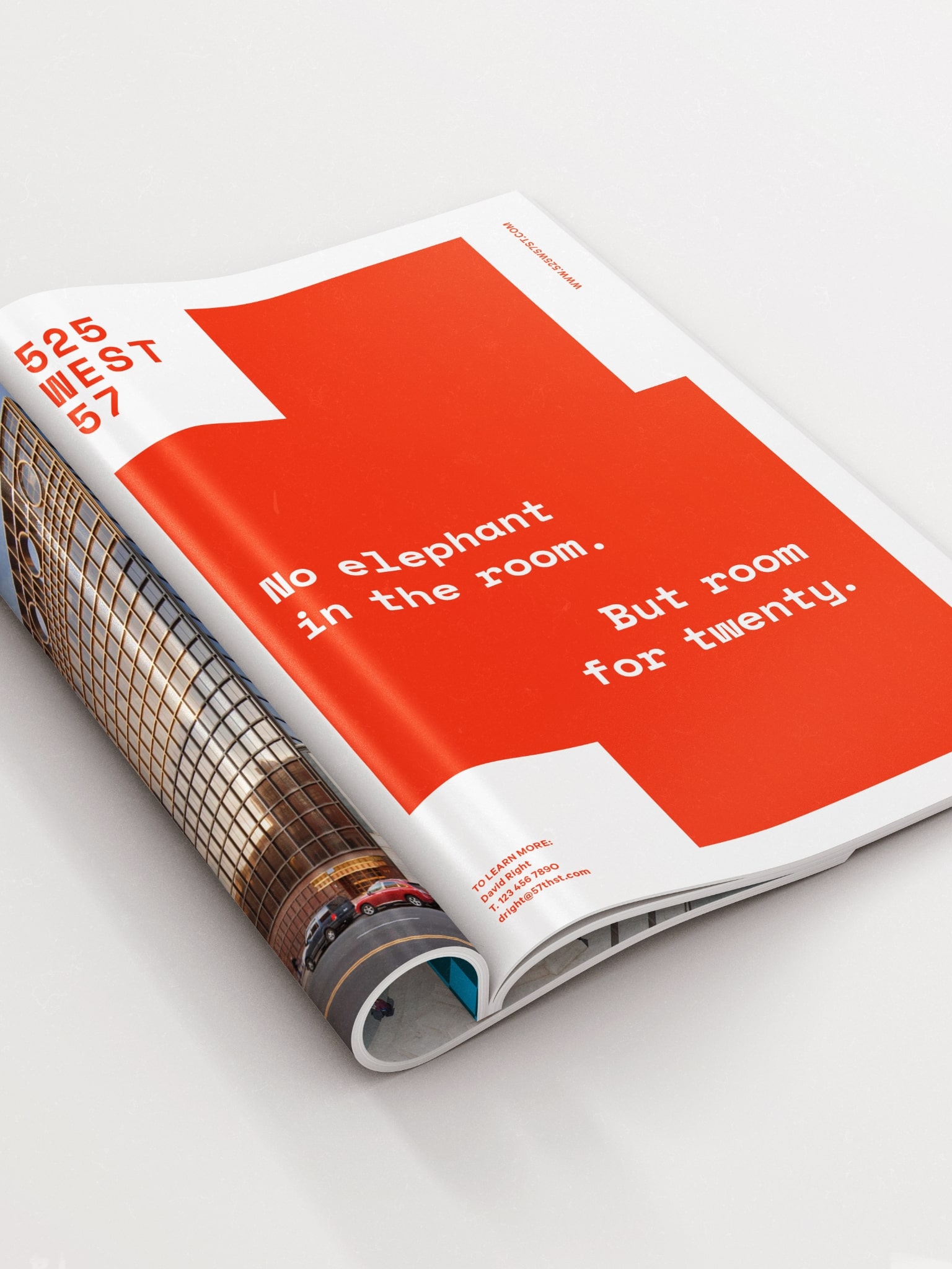
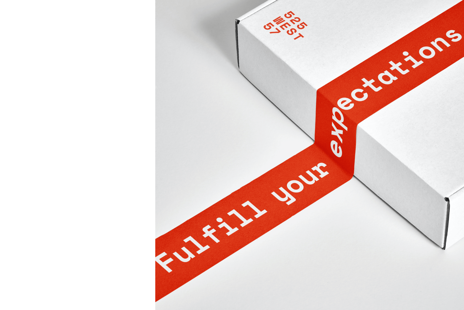
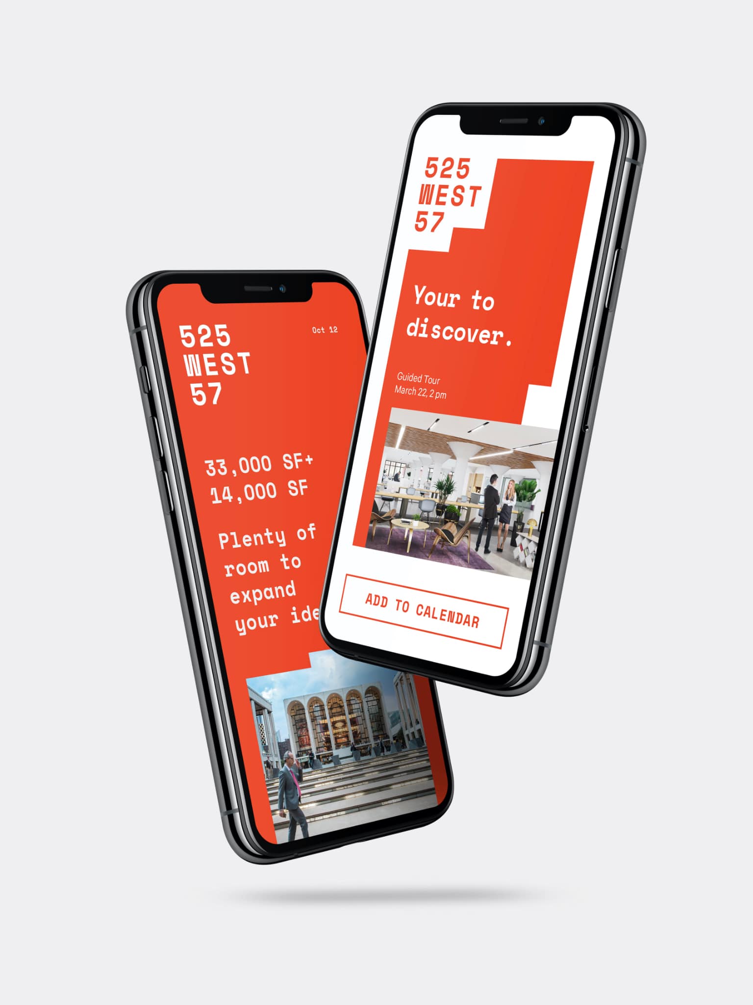
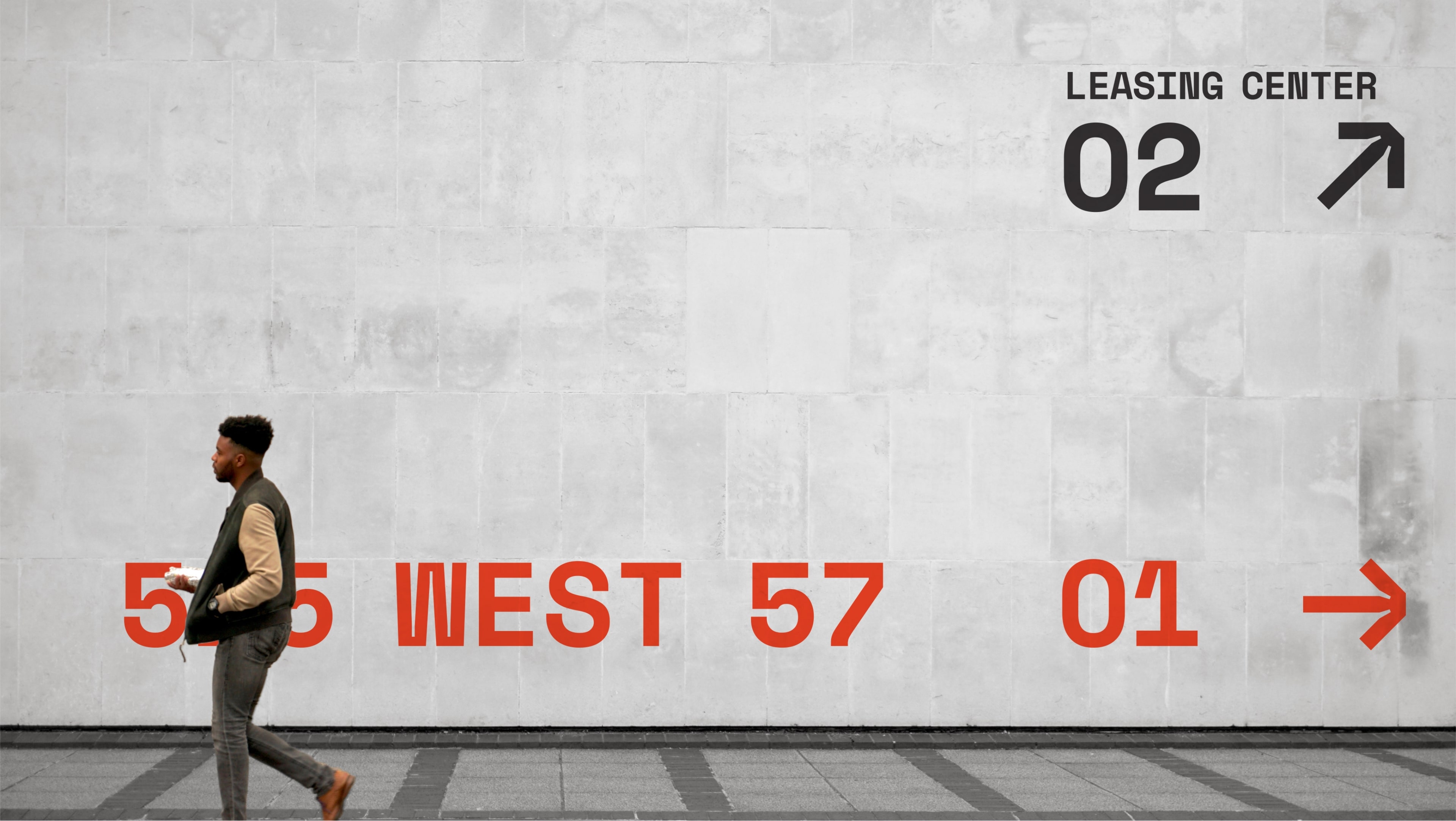
Designed for impact, the primary red is applied across a multitude of deliverables from the environment to diagrams to messaging, providing an unmistakable relationship to the property. The building blocks for an ever-changing design system, the adaptable configurations of various shapes are a visual representation of the building’s floor plates and its angular facade.
With practical and unadorned letterforms, the monospace typeface adds another layer further cementing the robust presence of the brand, and relaying the well-built and methodical operation of the property. The logomark pays homage to the building facade and its iconic square-shaped mullions while the brand language is direct and insightfully witty.


